British Land

British Land:
From Legacy to Leadership.
We’ve partnered with British Land for over a decade. This evolution modernises their 166-year-old brand to reflect their shift from traditional developer to innovation-led placemaker. As they create dynamic campuses and science hubs across the UK, the brand now mirrors their ambition. sustainable, human, AND future-focused, supportING growth in a rapidly changing sector.

A Strategic Evolution for a 166-Year Icon.
Inspired by British Land’s values and purpose, we re-energised the brand to reflect a more human, innovative future. From refining strategy to simplifying the portfolio, we created a cohesive identity system that brings clarity, ambition and relevance to every part of the business.

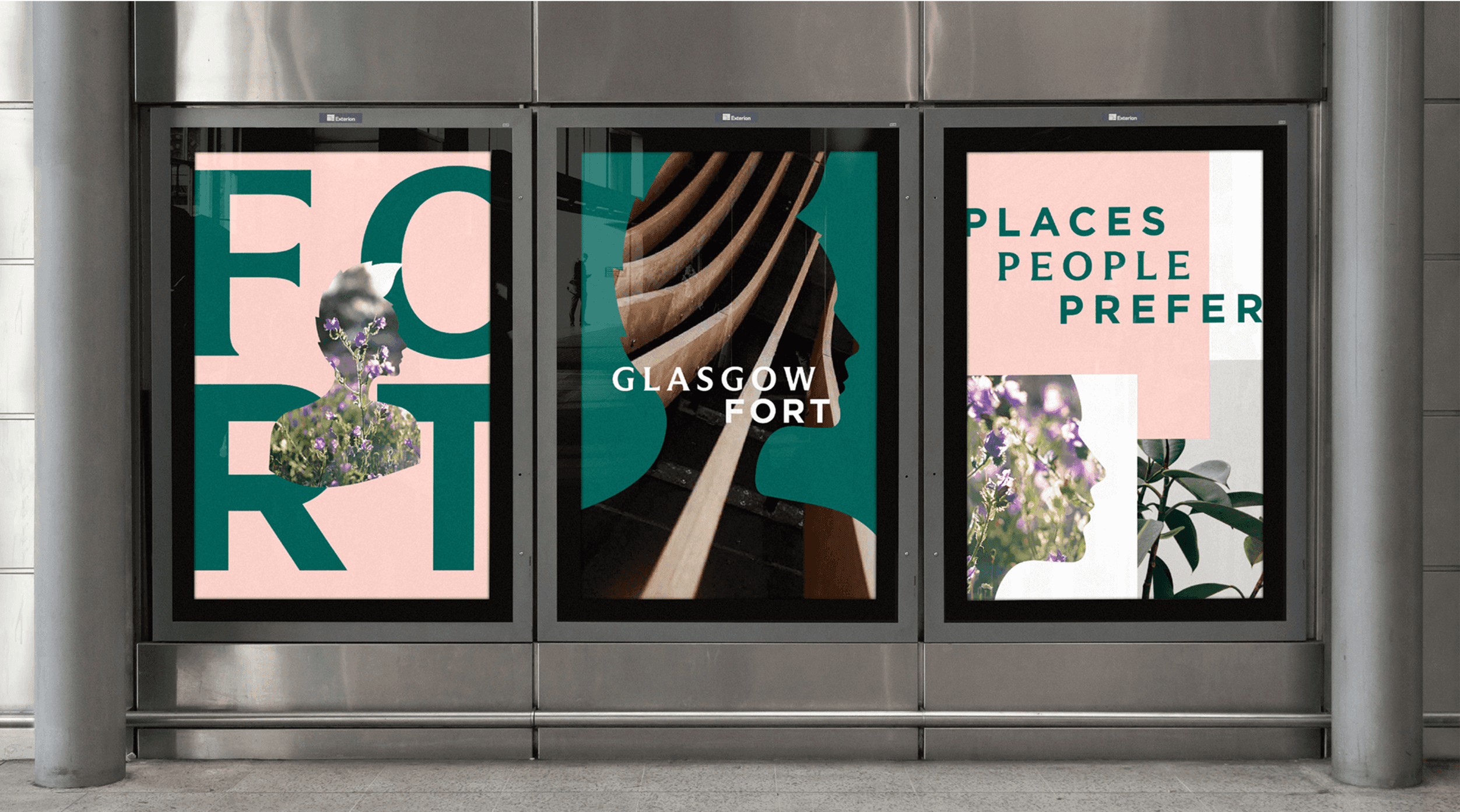
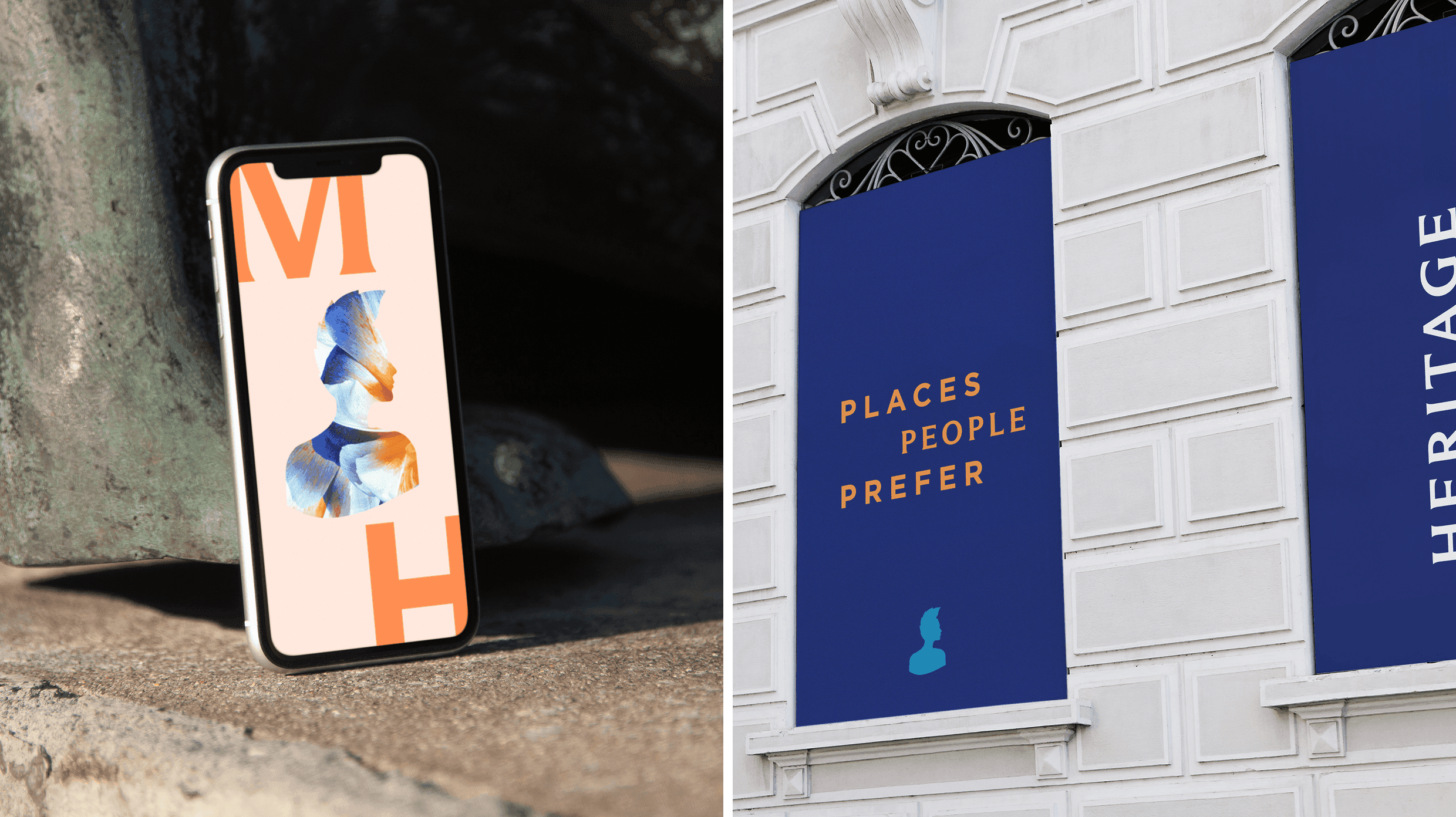
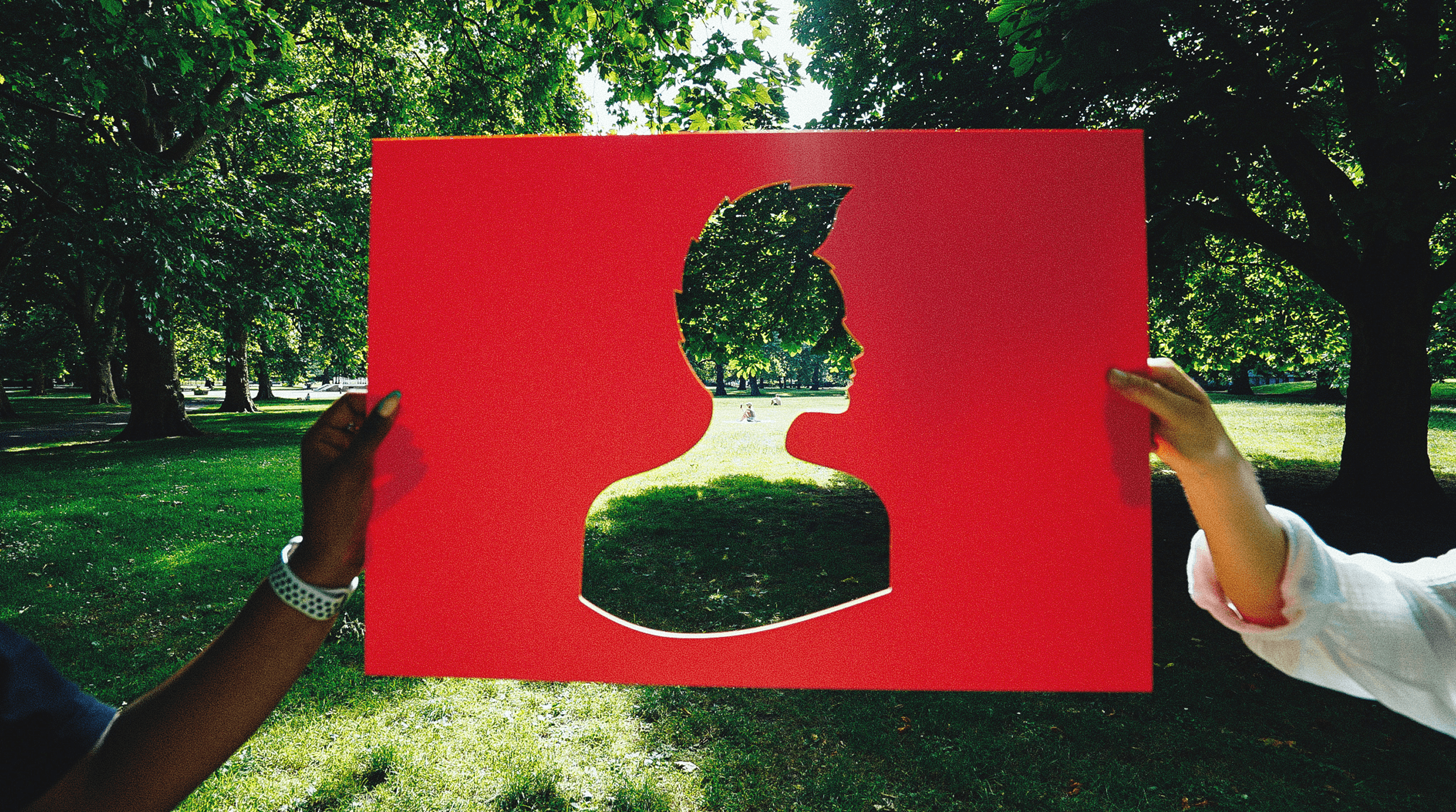
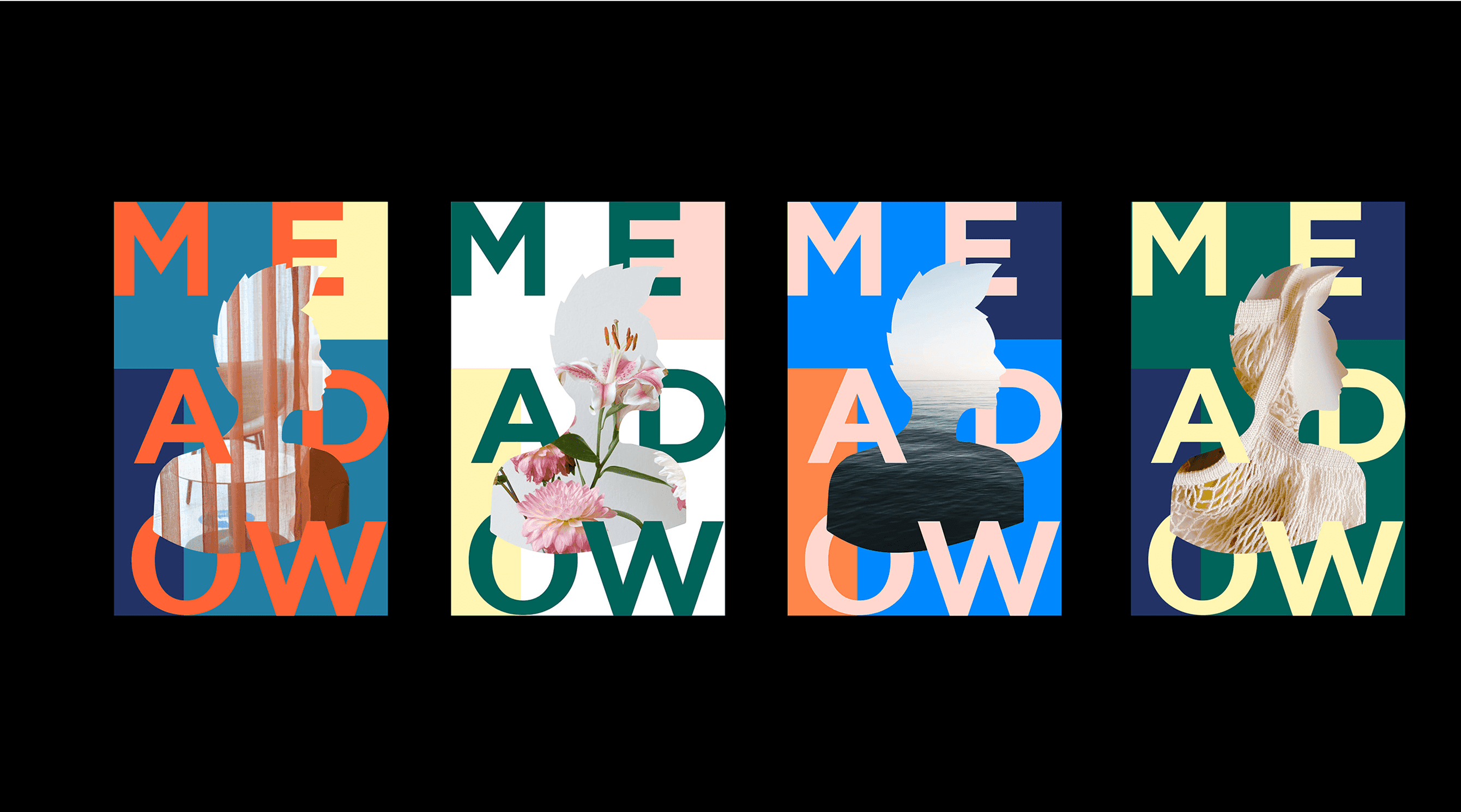
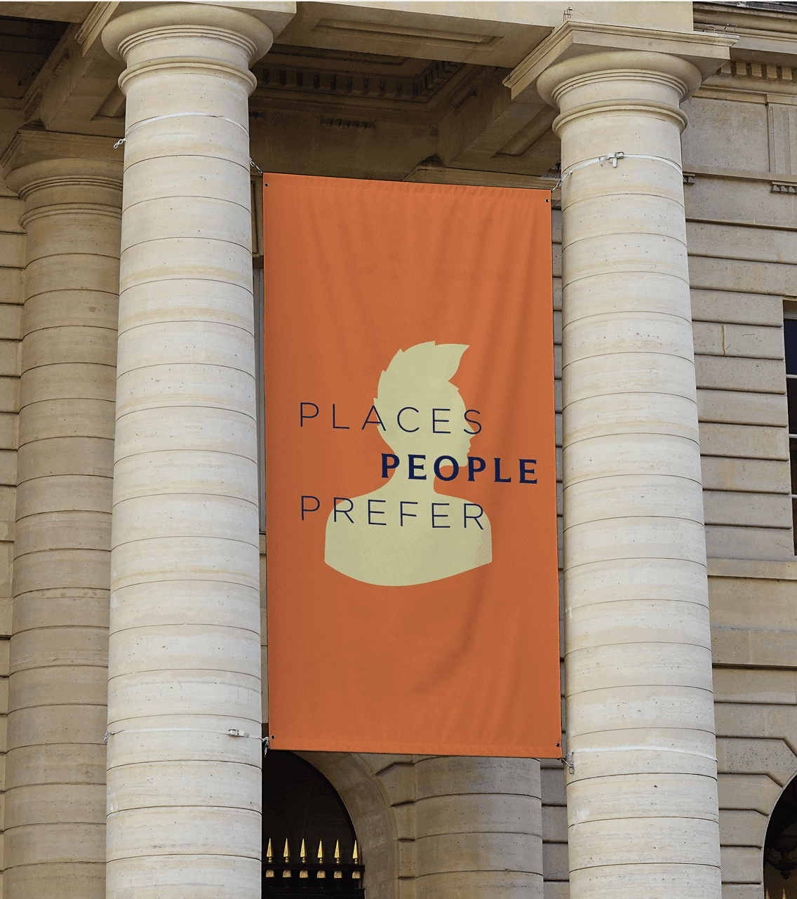
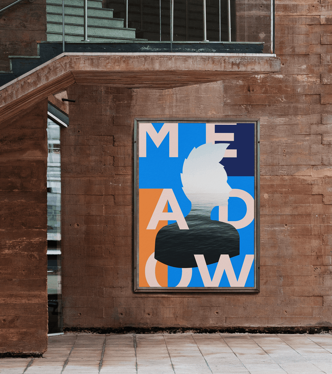
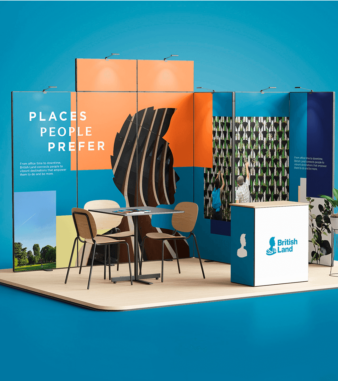
Giving Britannia new RELEVANCE.
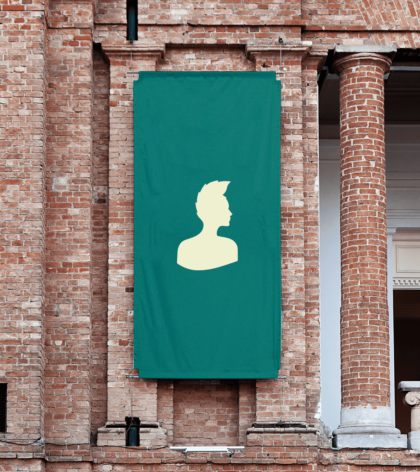
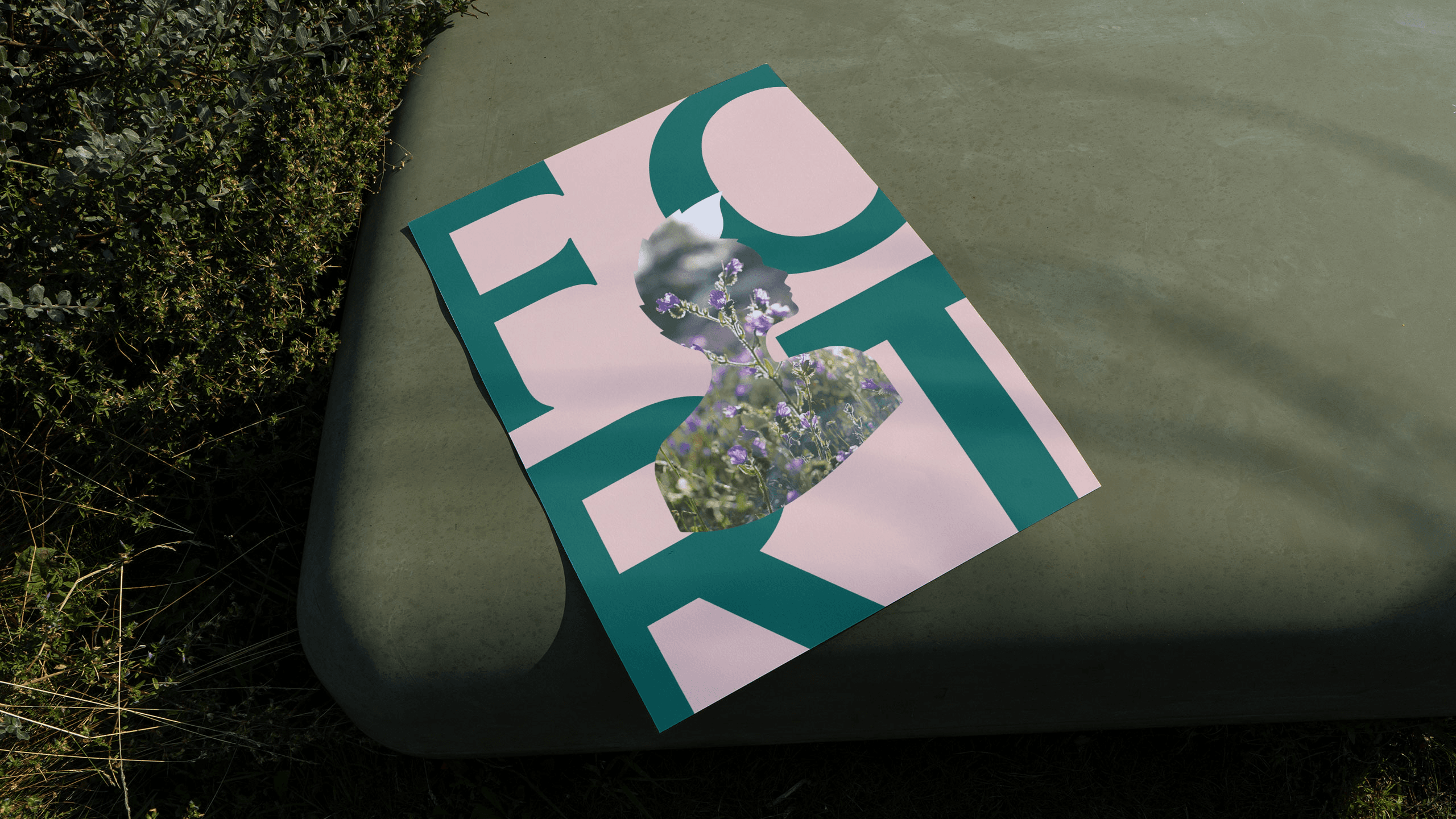
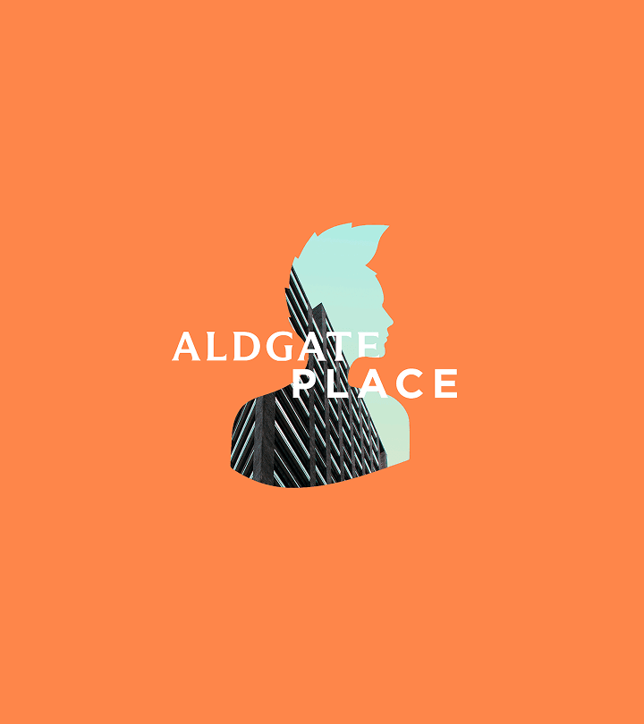
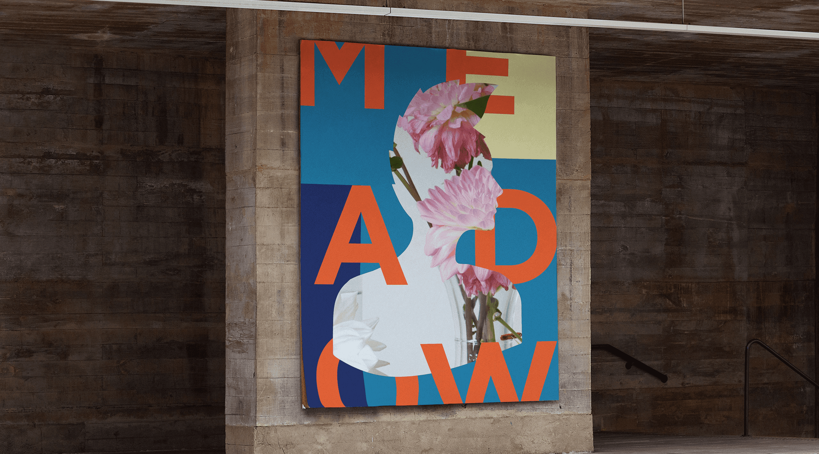
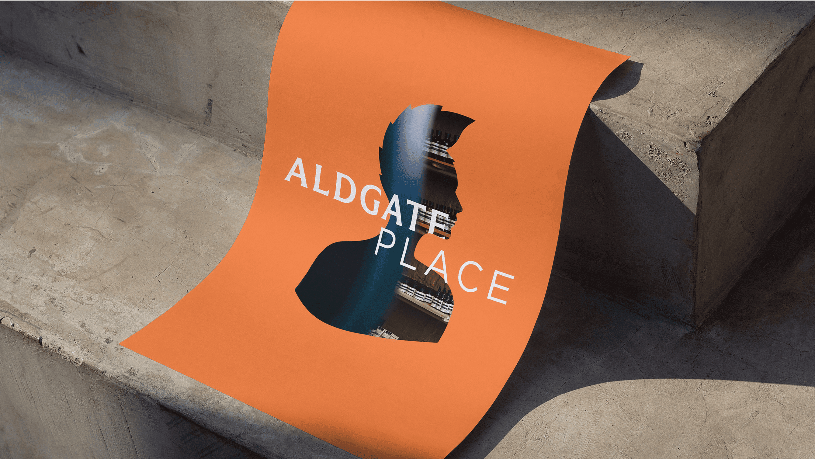
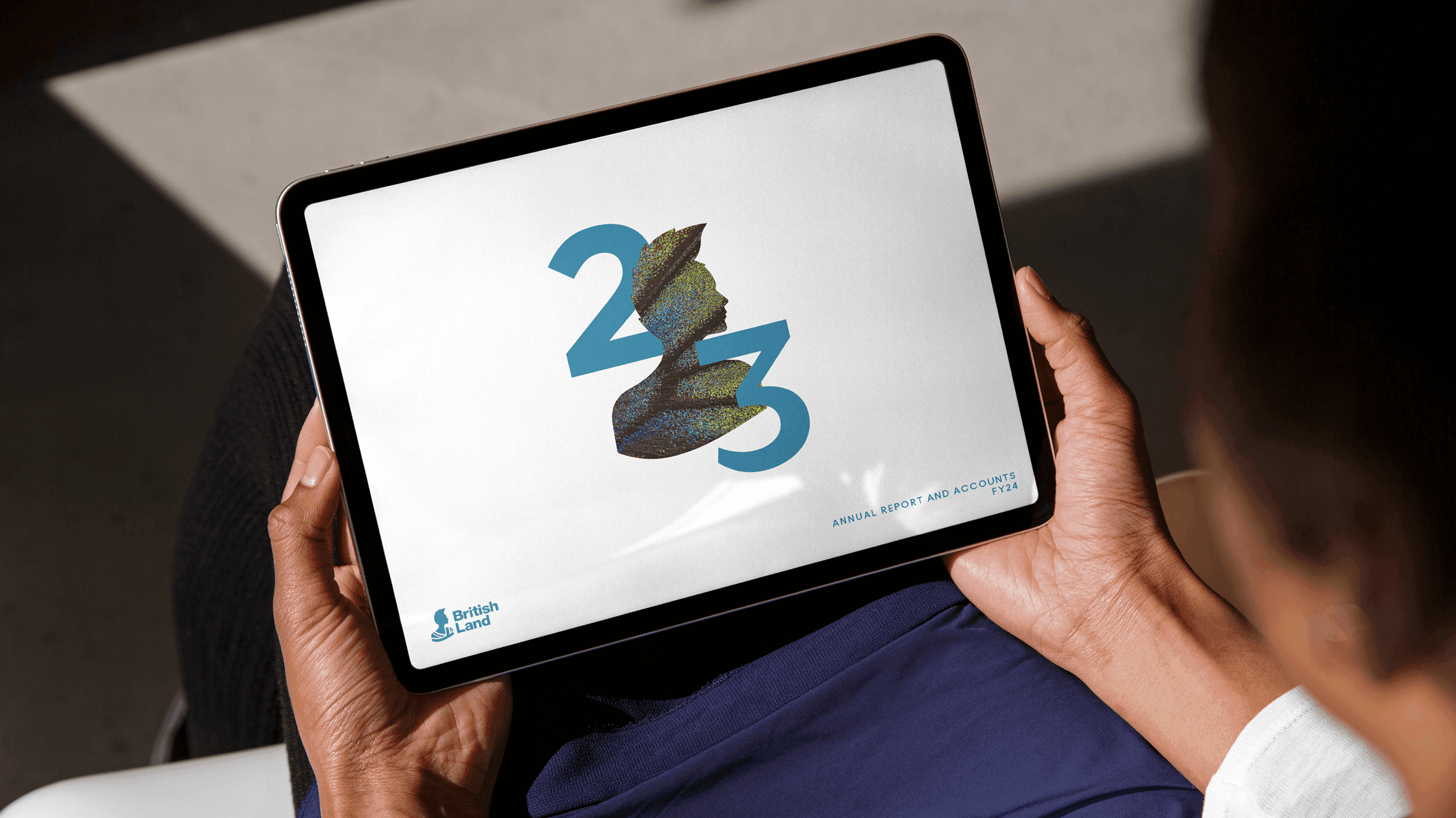
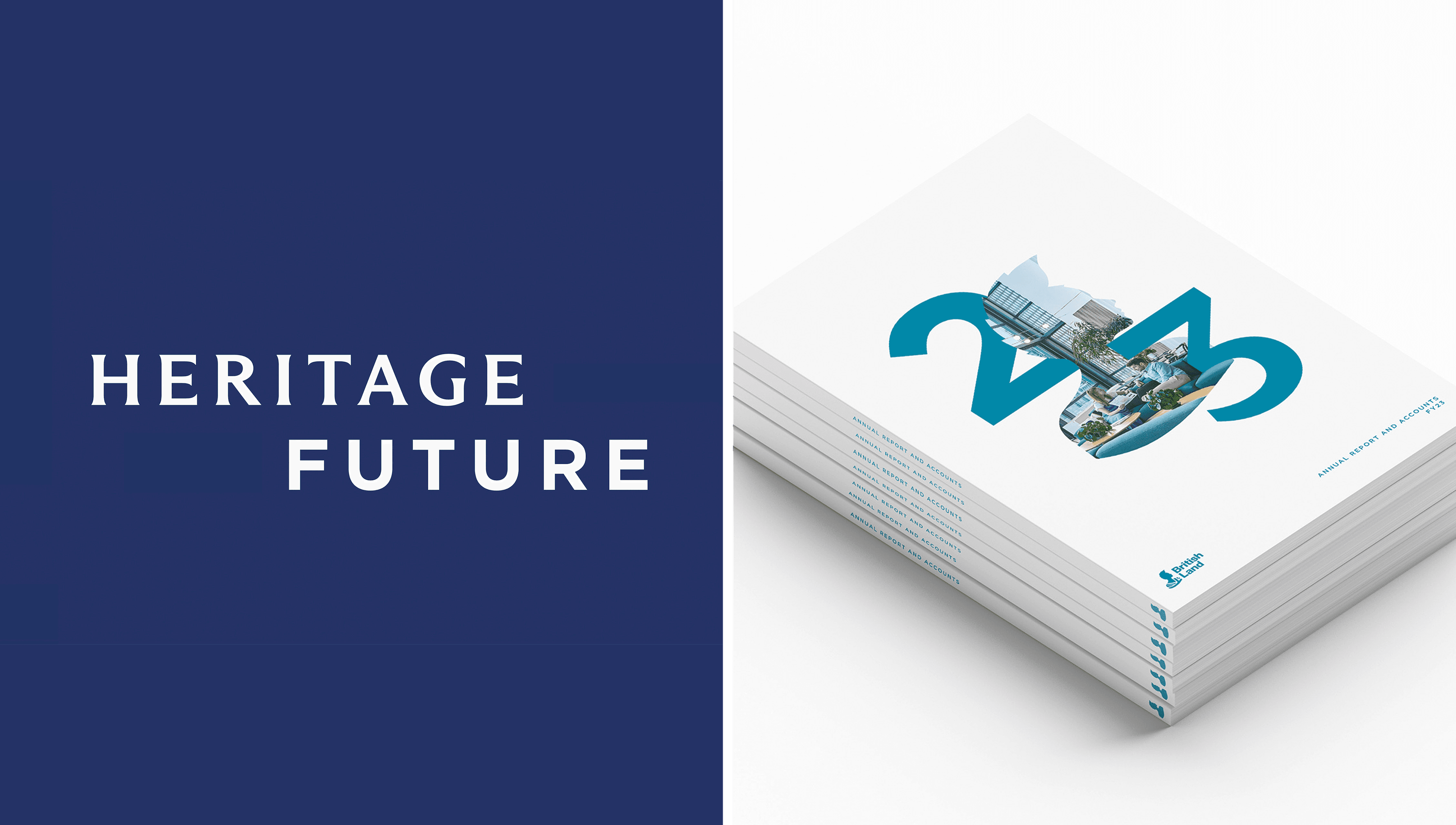
We refined the British Land icon into a simpler, modern form of Britannia. open, elegant and adaptable. No longer distant or corporate, it now acts as a beacon for the brand. Used as a bold silhouette, image-filled shape or see-through cut-out, it frames life across British Land’s neighbourhoods. Held in people’s hands, it becomes more human, inclusive and connected to the everyday places where people live, work and shop.


Rooted in heritage. Driven by ambition.
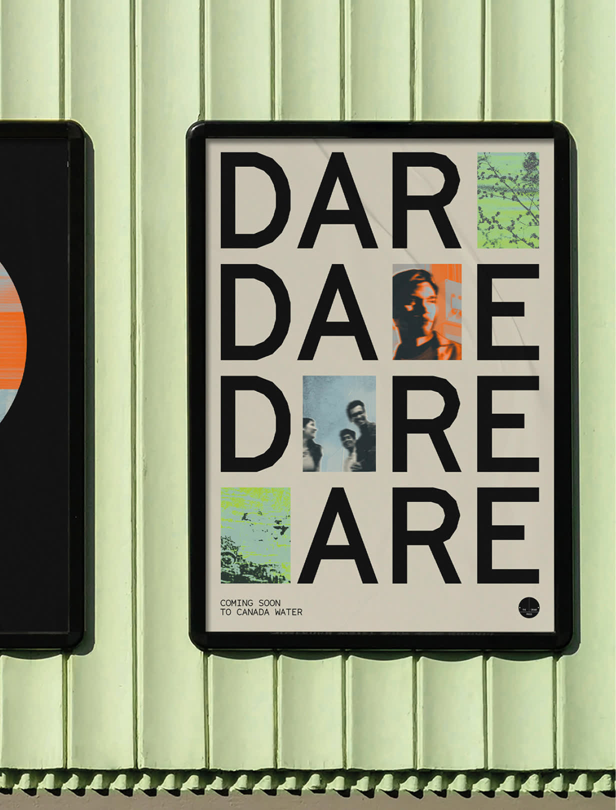
Creating one unified brand system meant balancing trust and heritage with modernity and adaptability. Built on a flexible grid, the system scales from bold and expressive for retail and campus brands to calm and confident for investor audiences. From vibrant campuses like Canada Water to corporate contexts, the identity flexes to meet each need. always rooted in British Land’s values and purpose.
Tactile, and Bold by Design.
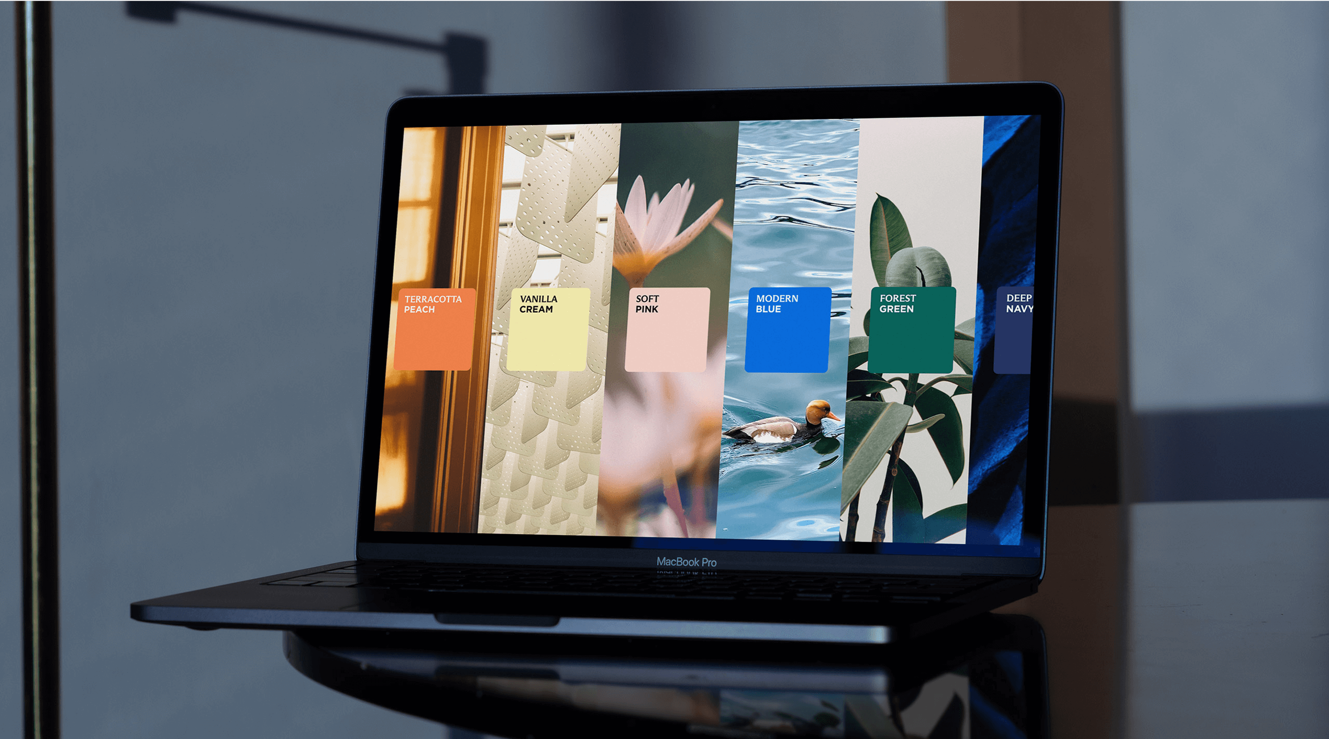
The bold, vibrant colour palette draws from British Land’s heritage. Core tones like Poppy Red and the brand’s signature teal reference British icons, while a tactile, warm secondary palette reflects the diverse environments across its campuses. Together they create a confident human expression, rooted in place and purpose.

DixonBaxi aligned our brand with our evolution sharpening our focus, broadening appeal and reflecting the ambition, scale and diversity of British Land FOR THE FUTURE.”