C The Signs
C The Signs:
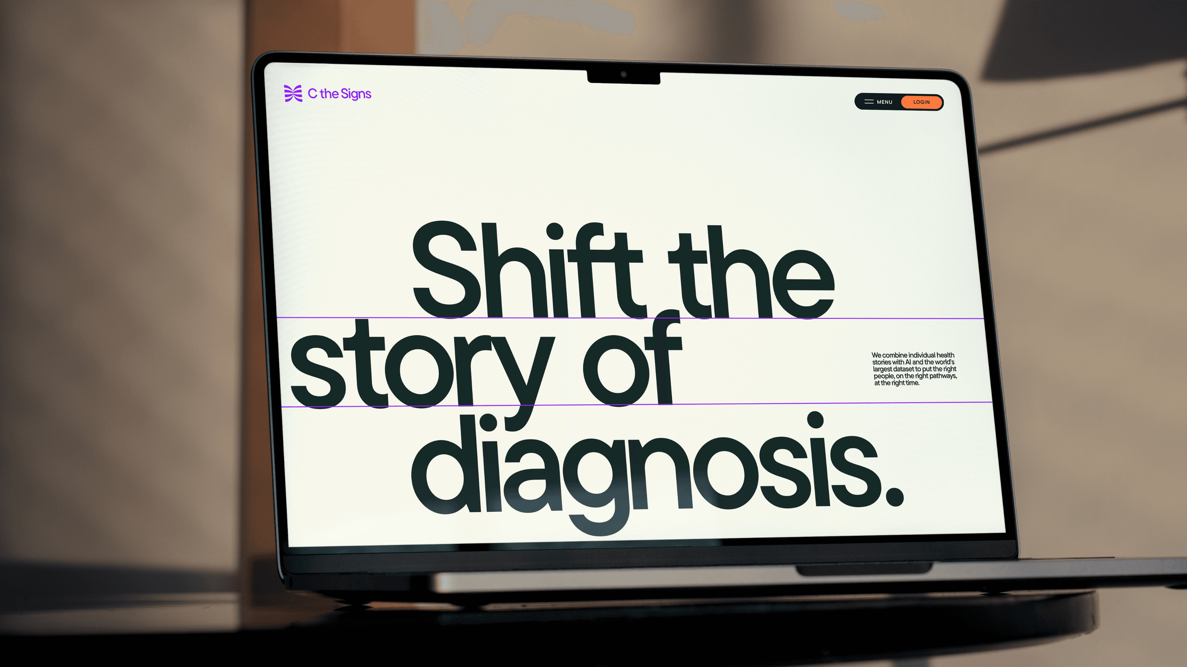
Rewrite the future of cancer with AI.
C the Signs is more than AI. It is a movement to make early cancer detection a right, not a privilege. While cancer doesn’t discriminate, access to diagnosis still does. C the Signs believes everyone deserves the same chance to survive. By working with patients, clinicians, and changemakers, they are rewriting the future of cancer care with real impact for people.


Seeing cancer differently.
We began by defining a strategy rooted in C the Signs’ founding purpose. Through in-depth interviews with clinicians, patients, founders, and the internal team, we uncovered the insight that shaped the project: everyone deserves a better outcome. C the Signs is changing the story of cancer, detecting it earlier, diagnosing it faster, and connecting people to equitable care.
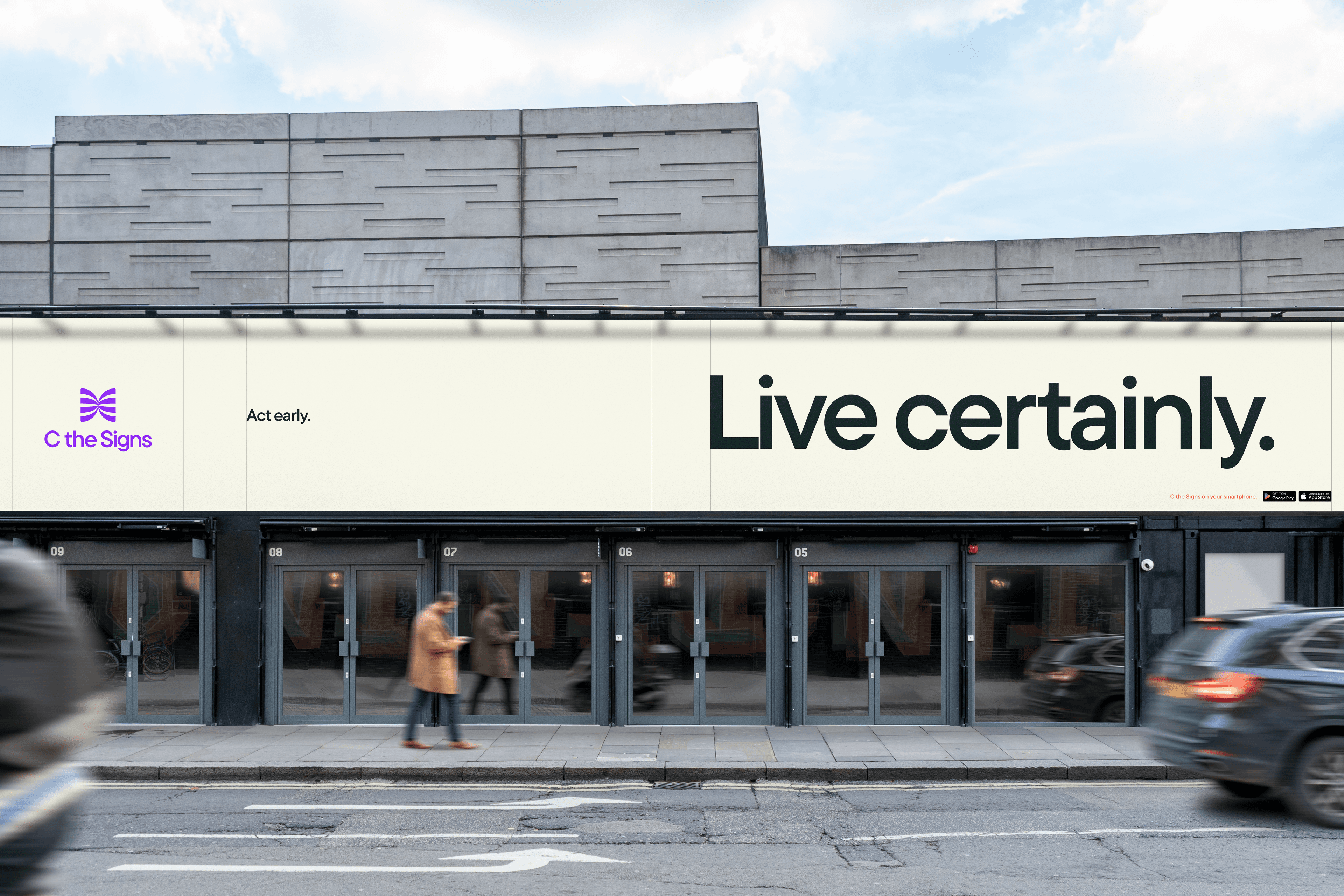
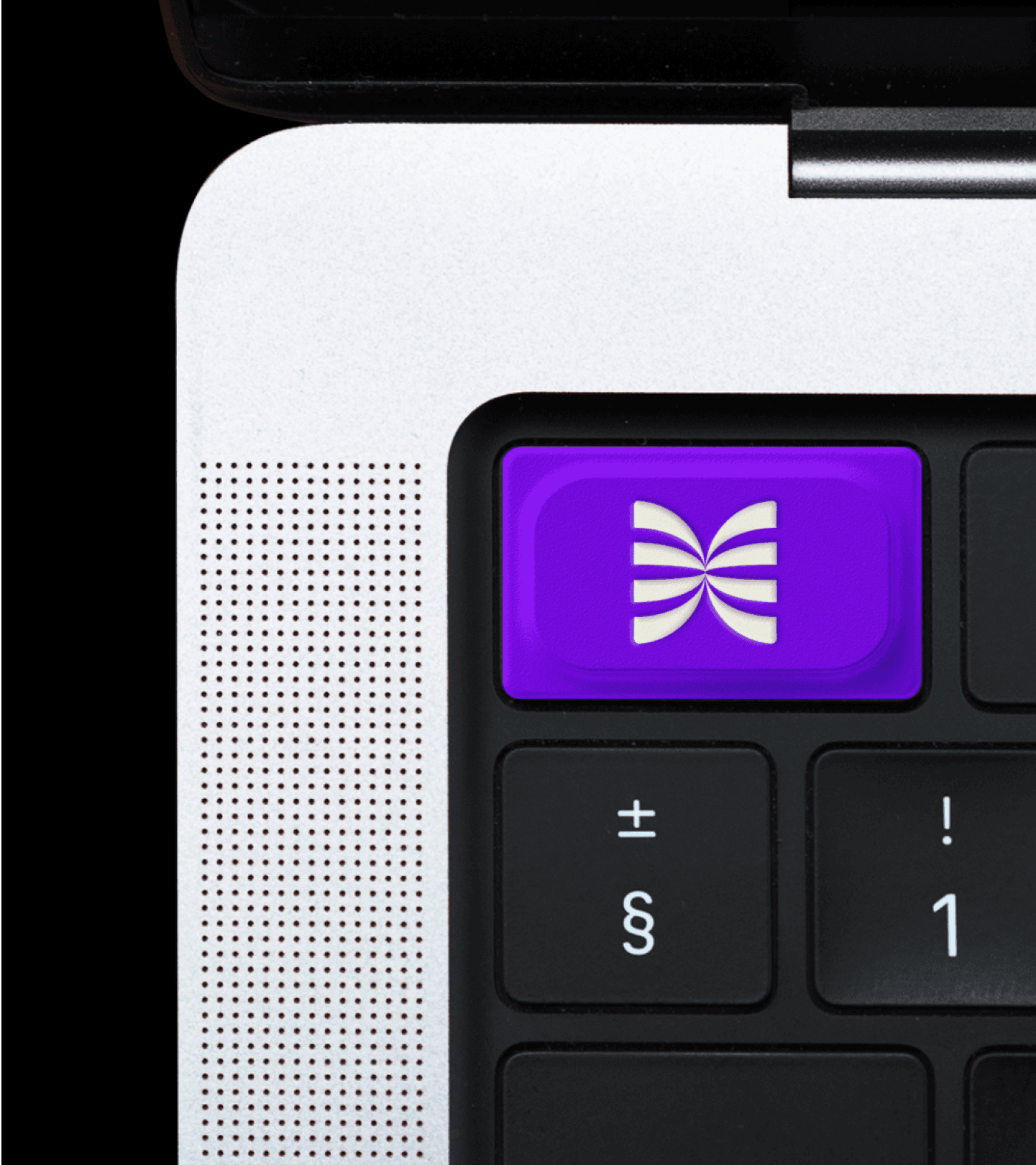
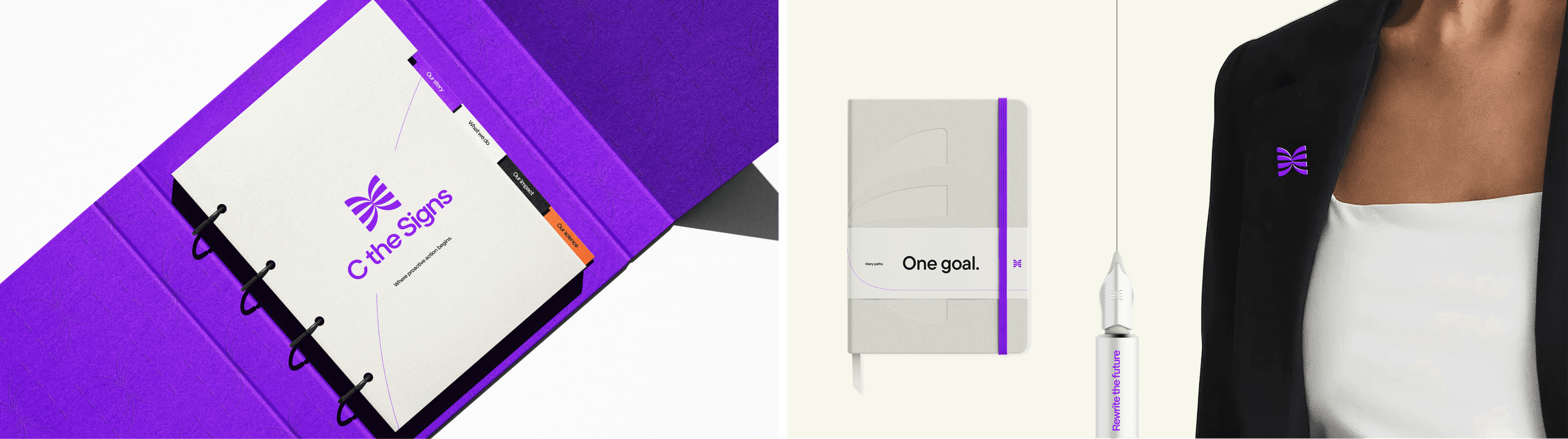
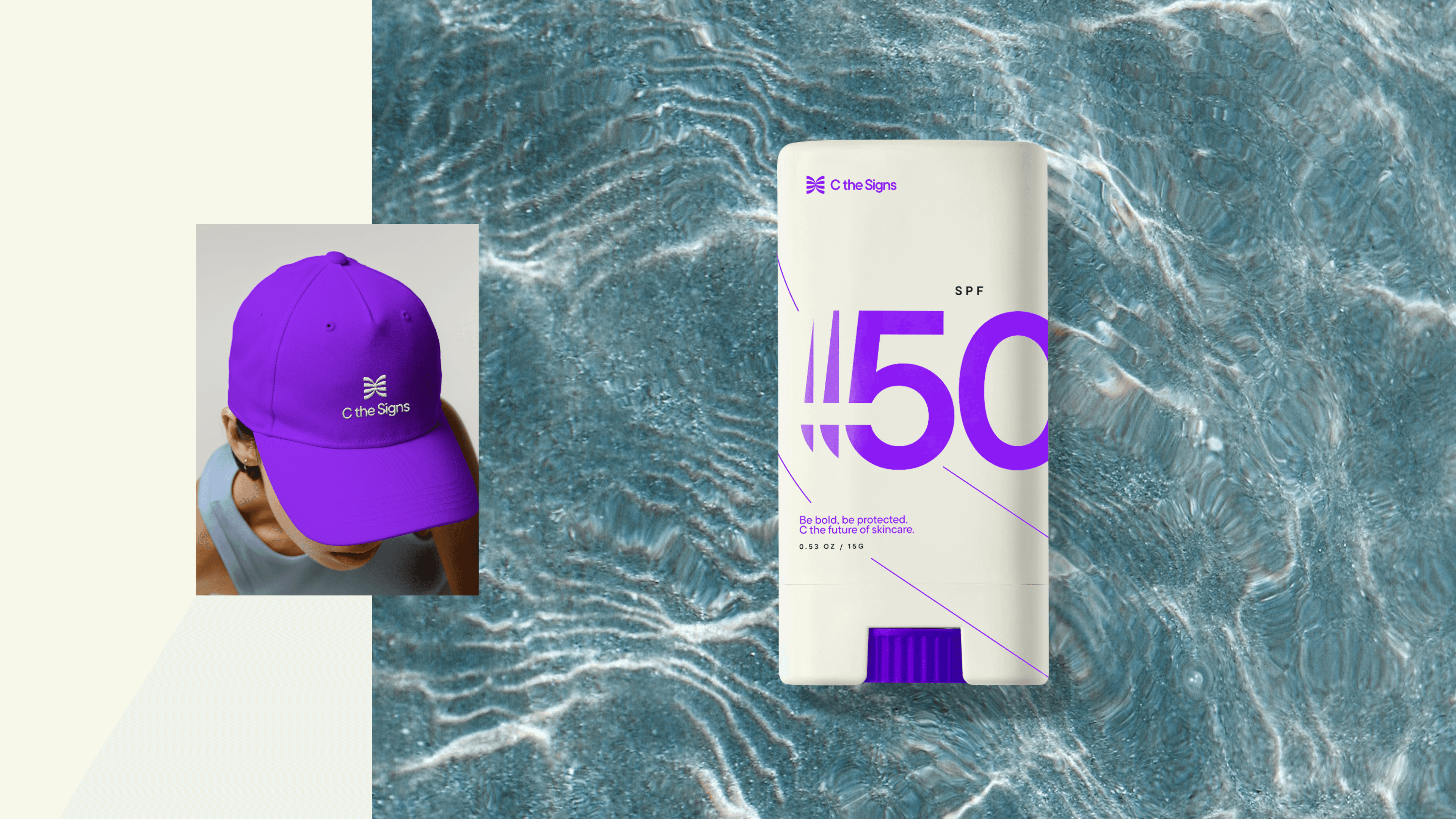
A symbol of positive, proactive care.
C the Signs uses AI to identify cancer risk at the earliest, most curable stage. We designed a new symbol inspired by
the Butterfly Effect, showing how early
action can lead to life-changing outcomes. It reflects a proactive approach that opens better treatment pathways and gives people a greater chance to rewrite their future.


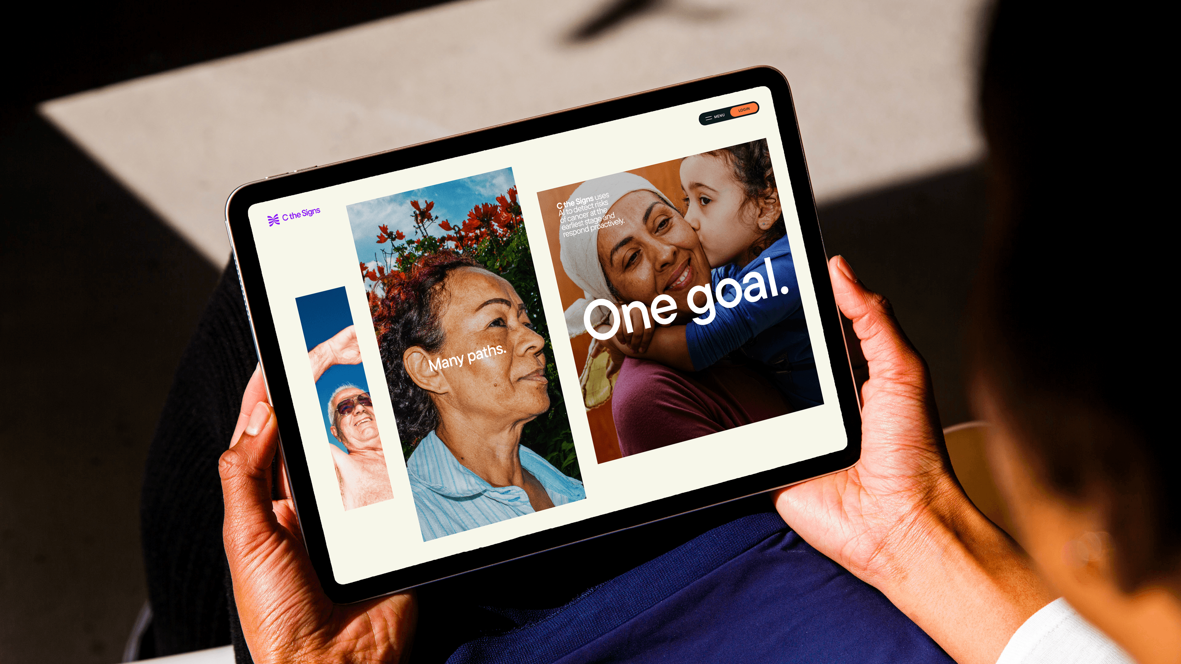
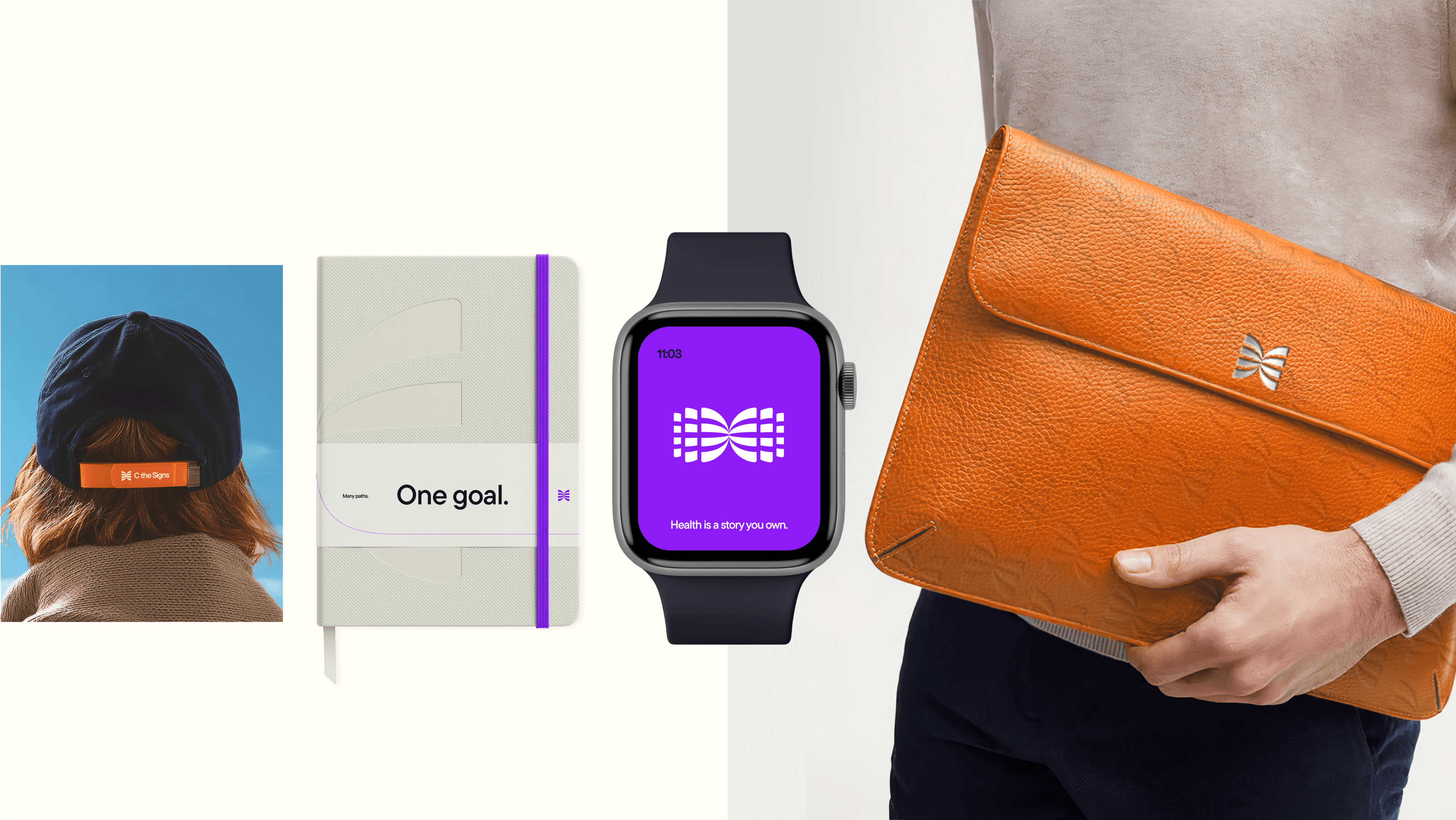
Putting people on the right pathways at the right time.
Storytelling sits at the heart of the new C the Signs brand. We created a design system inspired by the pathways you can take through life if you have the right options ahead of you. Our iconic logo activates, empowering us to amplify individual stories and show how C the Signs can put you on the right pathway at the right time.

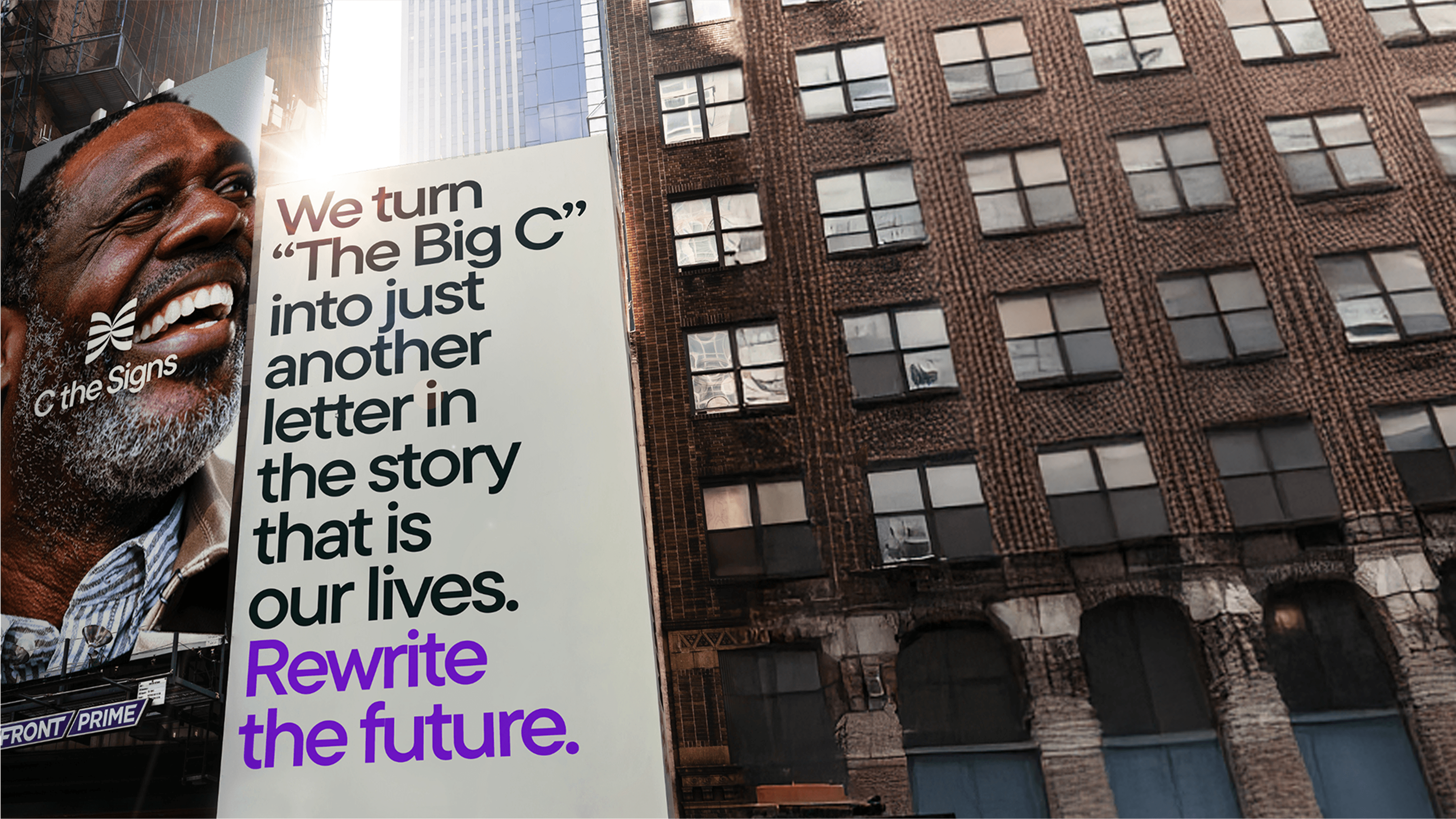
Rewriting the future.
The conversation around the ‘The Big C’ has always been one of fear. How it steals time, resources, and people.
We created an approach to tone of voice that challenges this convention to paint a vision of what’s possible. A future where time, outcomes and options are on our side. A new era for healthcare, made possible by early detection.
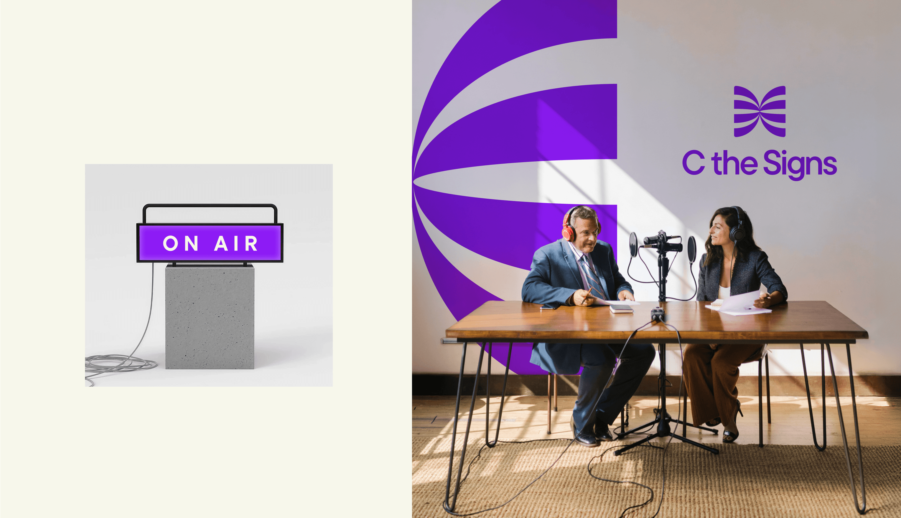
Built by Doctors. For doctors.
Every touchpoint from clinical tools to the website is designed to be clear, fast, and trustworthy. Built with accessibility at its core, the experience feels calm and intuitive, yet unmistakably C the Signs. Crafted to bring real stories and outcomes to life, the brand blends editorial clarity with bold innovation, capturing both the groundbreaking power of AI and its human impact.
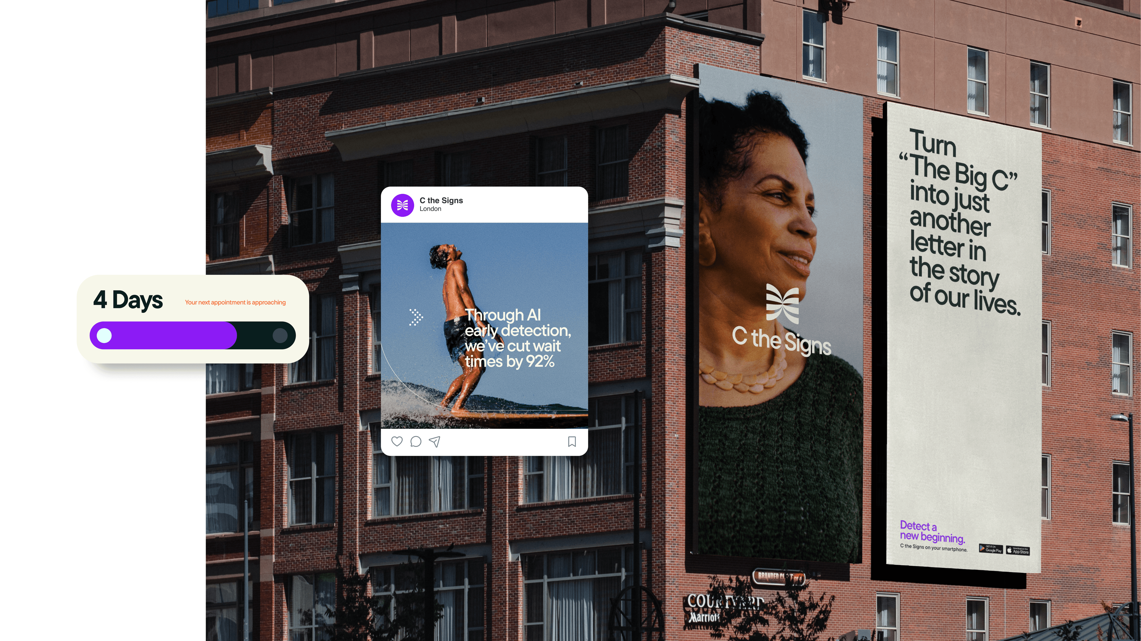


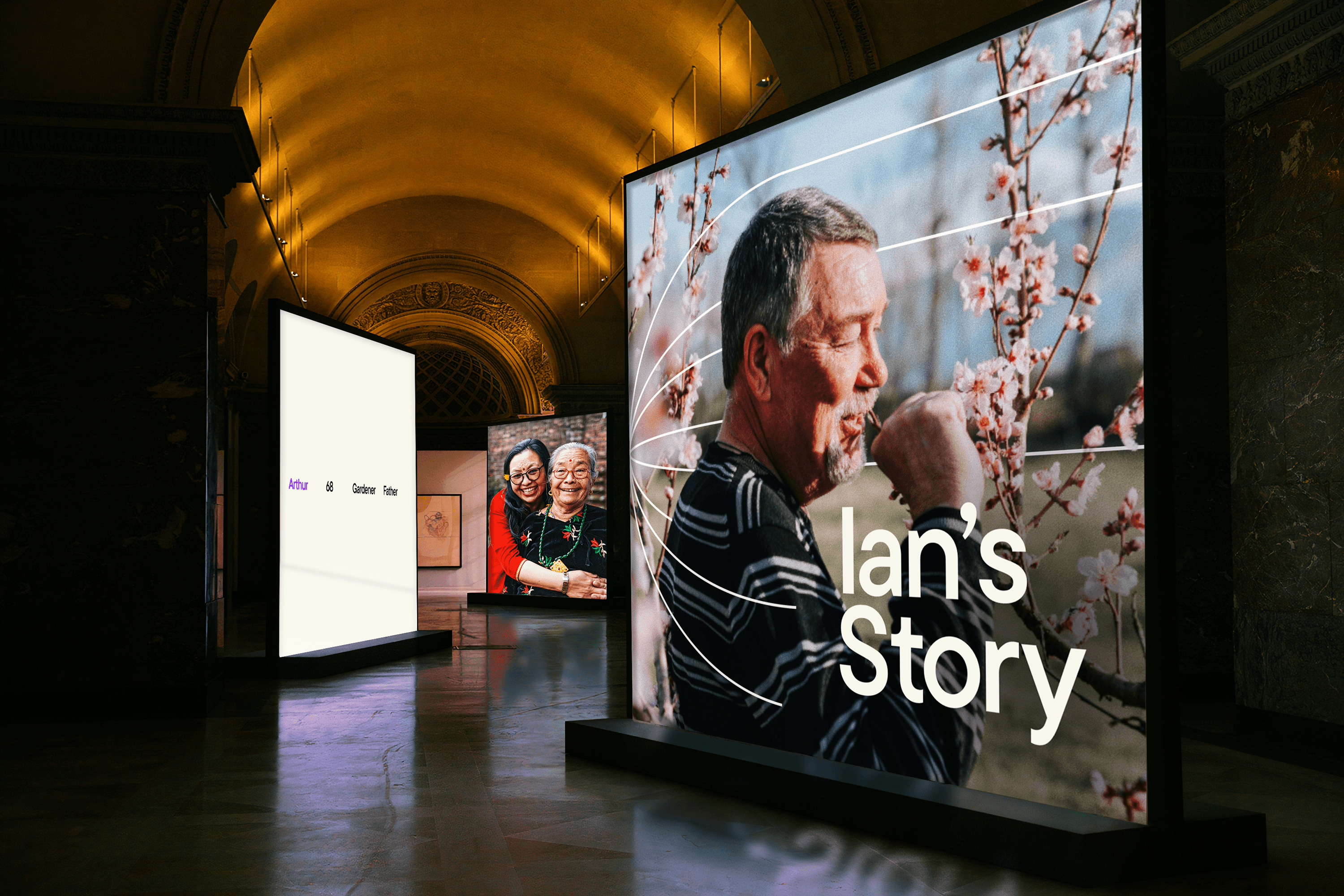
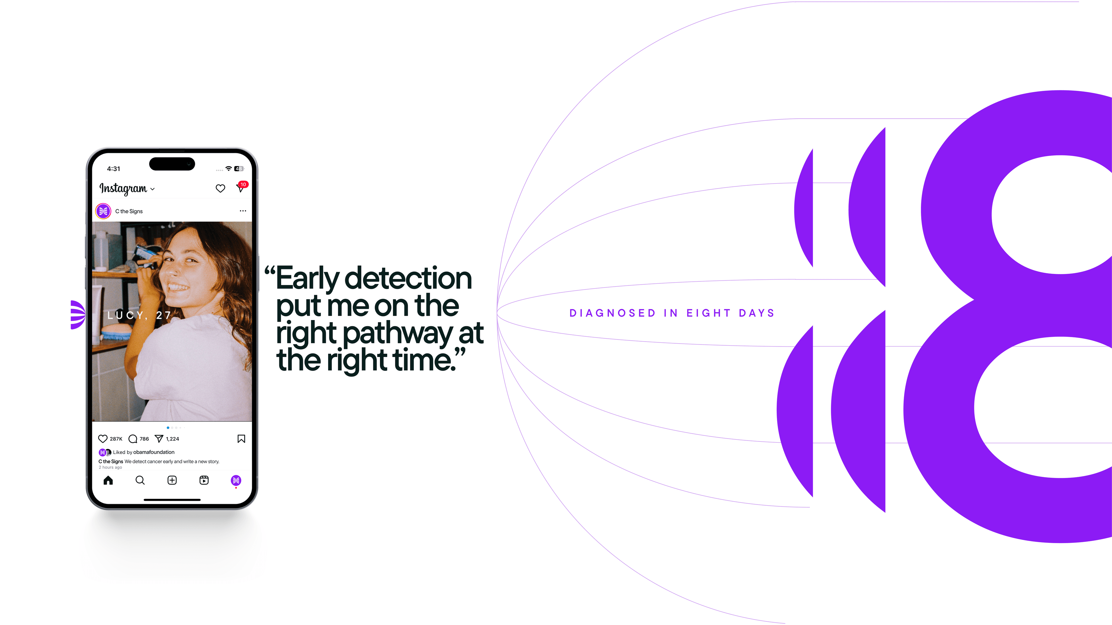
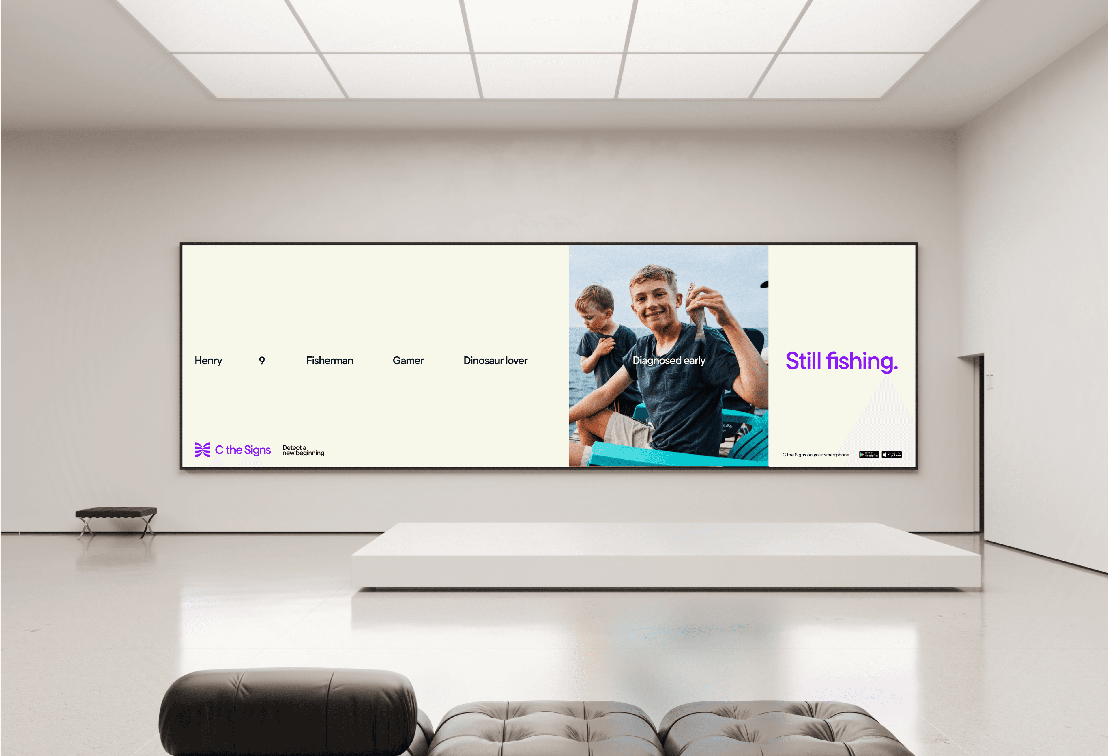
Real people. Real Stories.
So much of medical and healthcare brands are focused on the data and clinical outcomes. The C the Signs team had an ambition from the start of the project to connect the people to results. We focused on developing an art direction style that captured people thriving, whilst getting on with their lives. Adding warmth, character and showing that everything doesn’t stop with cancer.
We’re proud to have started in the NHS, shaped by the values it was built on: care, equity, and access for all. Now we’re taking our vision global, so wherever you live, early detection becomes possible and survival the norm.
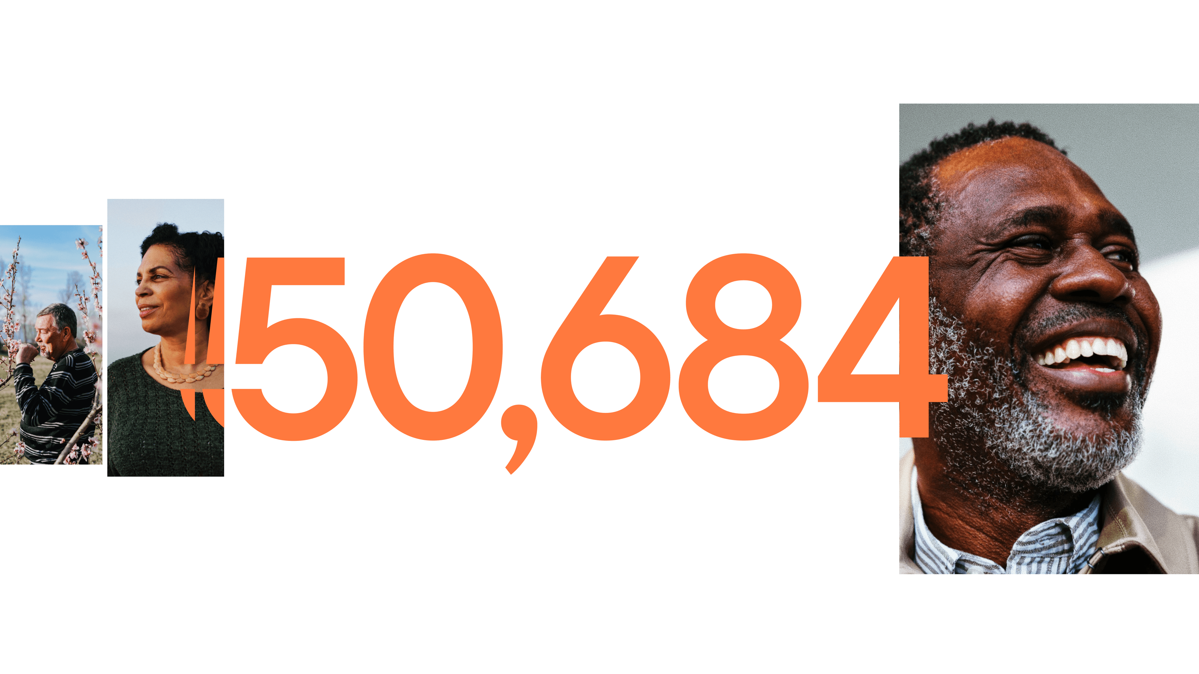
Over 50,000 patients with cancer detected, and counting.