

We’ve partnered with our friends at IMAX on a new experience with a visceral brand for IMAX Live, a new breed of limited edition event filmed and screened in IMAX, that reinvents the concept of venues by turning cinemas into arenas, stages, stadiums, lecture halls and more. It’s a true blend of entertainment and experience–an entirely new way for fans around the world to engage with their favourite visionaries. Each one-night-only event has a limited number of tickets making them as coveted as they are elusive.


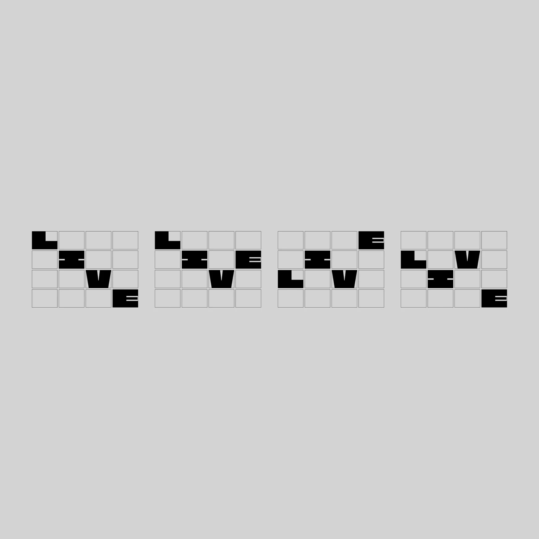
Using a grid set to the 1:43:1 IMAX ratio, we have created a system that pushes IMAX into the future while paying homage to their incredible history. The logo is bold, confident and uncompromising, combining the iconic IMAX logotype with a new, hyper-bold LIVE wordmark that’s double the size. Nostra, the extra-wide, monospaced typeface has extreme proportions for maximum impact, all based on the IMAX ratio grid. The monolithic letters create space for the unconventional and surprising, where artists, athletes and visionaries burn brightly.
IMAX Live Orange is the hero of the primary colour palette, and the invert of IMAX Blue, signifying the breaking of convention. It’s loud and warm, bathing entire audiences in the glow synonymous with the lighting of live shows. Paired with white, black and a secondary palette of versatile purples and green, the palette is as vibrant and sophisticated as it is ownable. The full spectrum allows for the high degree of flexibility necessary to compliment the outstanding range of visual content IMAX Live offers.


.jpg)

The brand’s motion behaviour is central to conveying the energy of live events. We began with a simple question: what does live feel like? The final range of motion behaviours is immersive, plunging viewers into larger-than-life lettering, logos and jaw-dropping visuals. There’s a sense of preserved energy that comes from the push and pull of the animation, building suspense and awe as footage flickers to life or consumes the entire screen. It’s a kind of fleeting drama that’s always moving and gone in the blink of an eye.
From the outset, the ambition was to confound the world by flipping what’s expected of IMAX. They’re known for their cinematic experiences, but this was all about breaking convention, so we purposefully went in the opposite direction. Inverting the IMAX Blue, going from all caps to lowercase typography–it’s all to move the brand into the future and capture an unmissable live feeling.


We’ve partnered with our friends at IMAX on a new experience with a visceral brand for IMAX Live, a new breed of limited edition event filmed and screened in IMAX, that reinvents the concept of venues by turning cinemas into arenas, stages, stadiums, lecture halls and more. It’s a true blend of entertainment and experience–an entirely new way for fans around the world to engage with their favourite visionaries. Each one-night-only event has a limited number of tickets making them as coveted as they are elusive.


Using a grid set to the 1:43:1 IMAX ratio, we have created a system that pushes IMAX into the future while paying homage to their incredible history. The logo is bold, confident and uncompromising, combining the iconic IMAX logotype with a new, hyper-bold LIVE wordmark that’s double the size. Nostra, the extra-wide, monospaced typeface has extreme proportions for maximum impact, all based on the IMAX ratio grid. The monolithic letters create space for the unconventional and surprising, where artists, athletes and visionaries burn brightly.


IMAX Live Orange is the hero of the primary colour palette, and the invert of IMAX Blue, signifying the breaking of convention. It’s loud and warm, bathing entire audiences in the glow synonymous with the lighting of live shows. Paired with white, black and a secondary palette of versatile purples and green, the palette is as vibrant and sophisticated as it is ownable. The full spectrum allows for the high degree of flexibility necessary to compliment the outstanding range of visual content IMAX Live offers.
The brand’s motion behaviour is central to conveying the energy of live events. We began with a simple question: what does live feel like? The final range of motion behaviours is immersive, plunging viewers into larger-than-life lettering, logos and jaw-dropping visuals. There’s a sense of preserved energy that comes from the push and pull of the animation, building suspense and awe as footage flickers to life or consumes the entire screen. It’s a kind of fleeting drama that’s always moving and gone in the blink of an eye.


From the outset, the ambition was to confound the world by flipping what’s expected of IMAX. They’re known for their cinematic experiences, but this was all about breaking convention, so we purposefully went in the opposite direction. Inverting the IMAX Blue, going from all caps to lowercase typography–it’s all to move the brand into the future and capture an unmissable live feeling.

